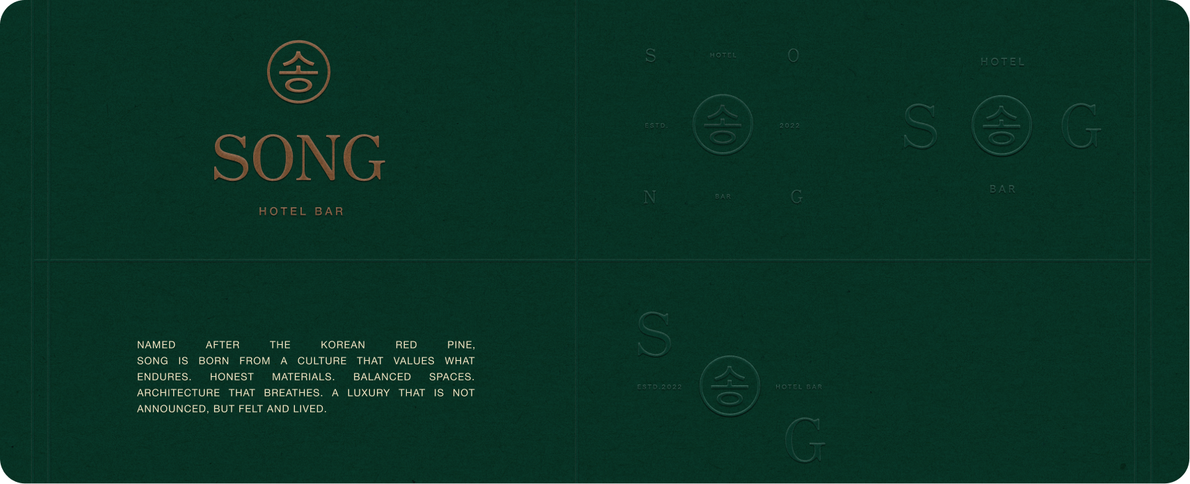
Song
Services
- Brand Strategy
- Visual Identity
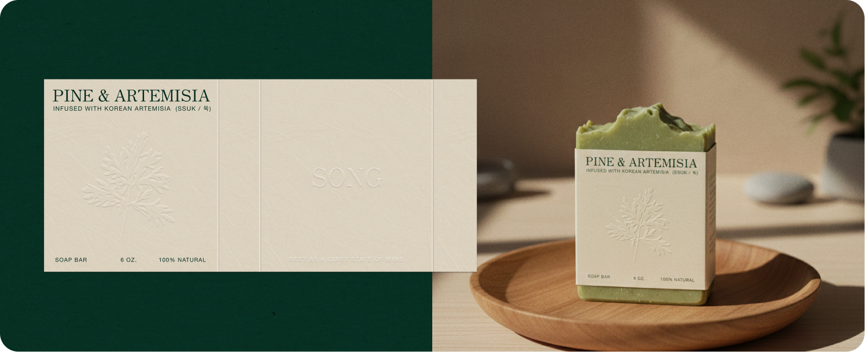
- Packaging Design
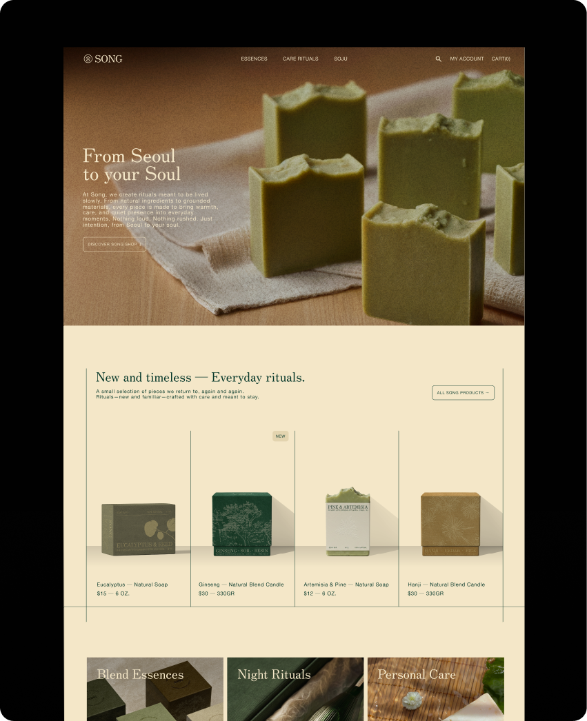
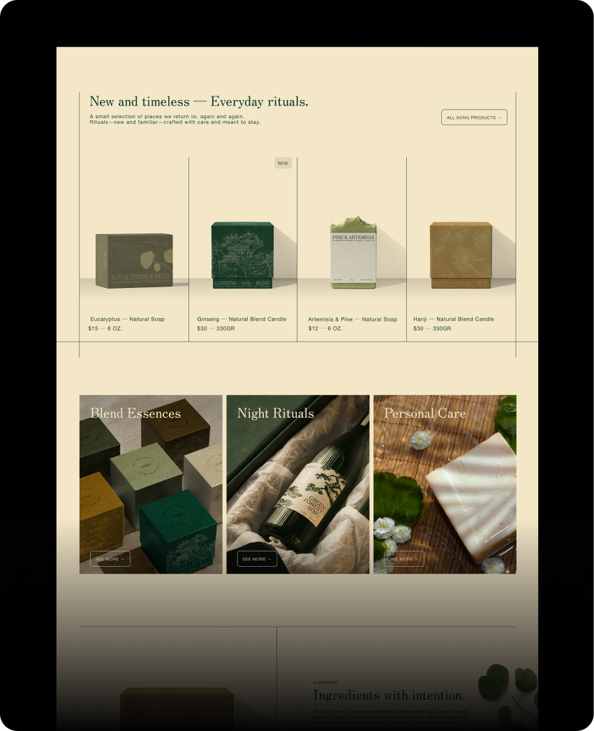
- Landing Page
- AI Photo Studio
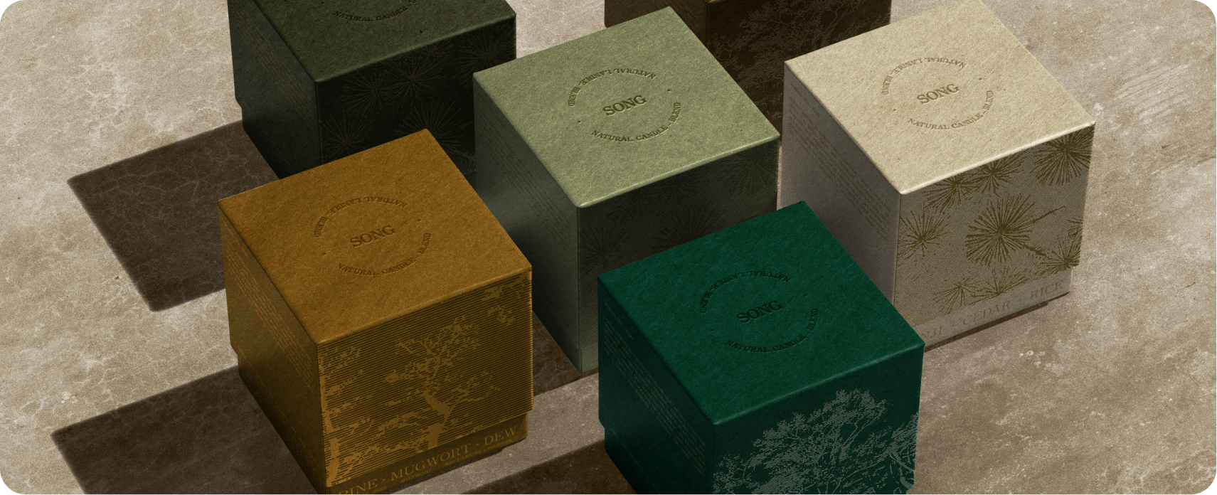
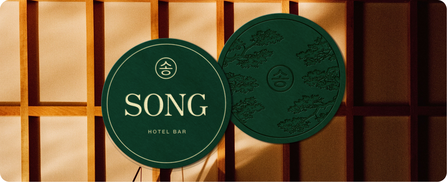
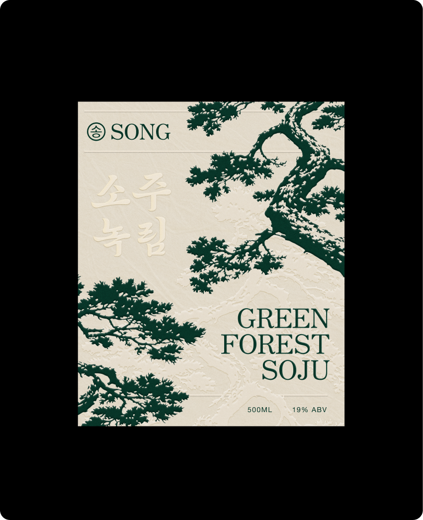
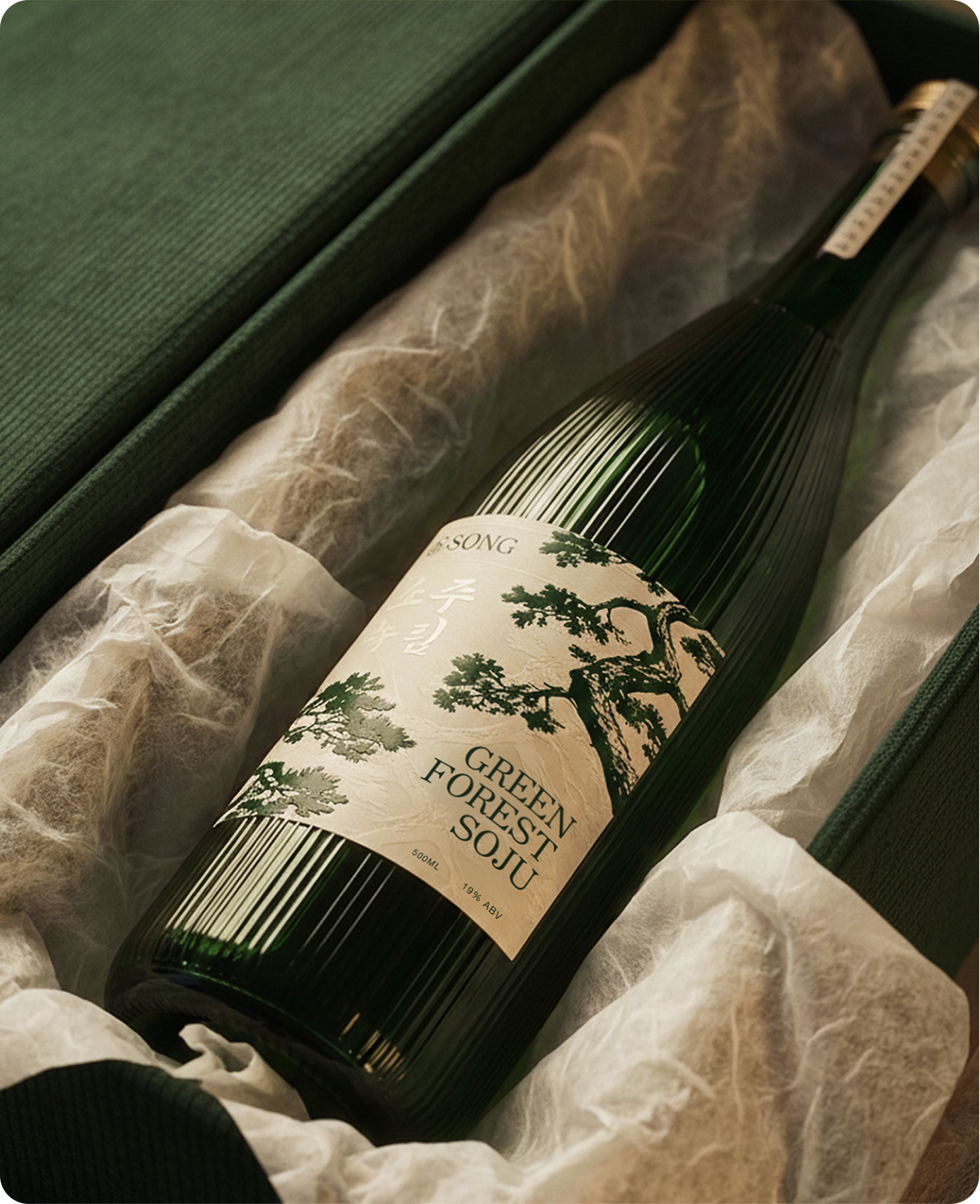
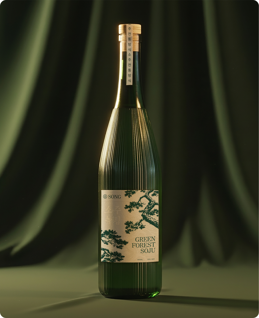
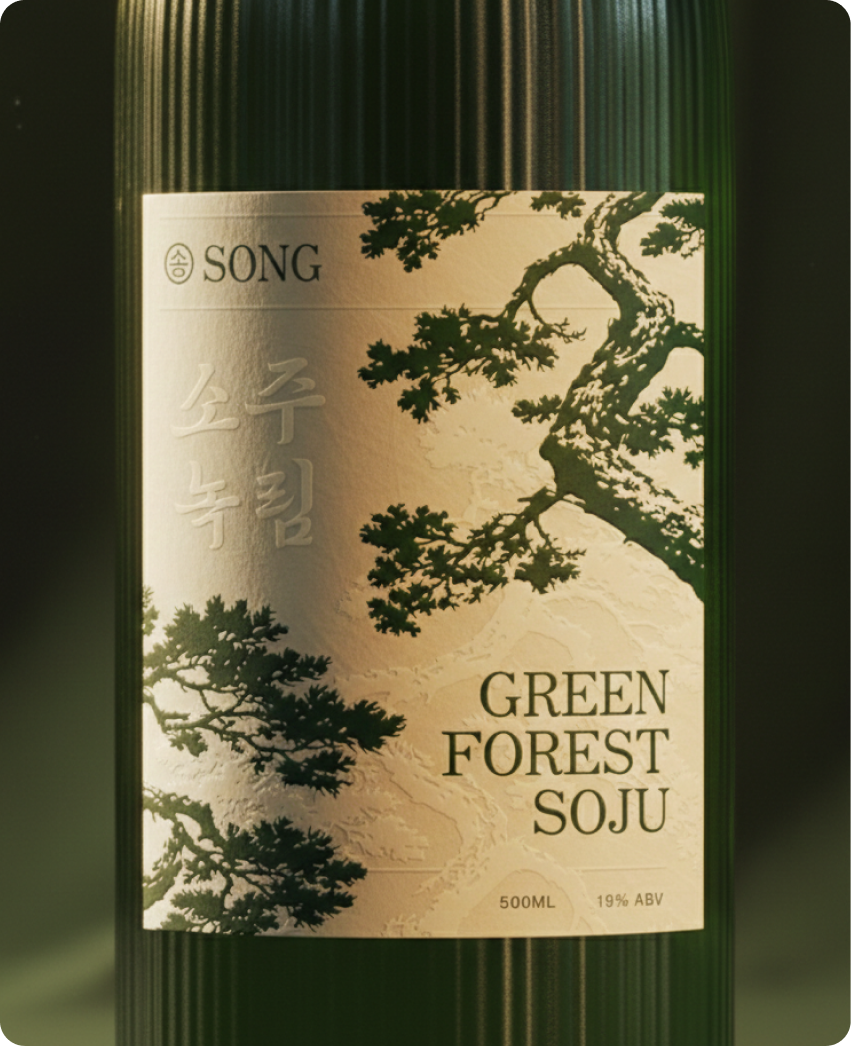
A full brand identity for a Korean-inspired hotel bar concept.
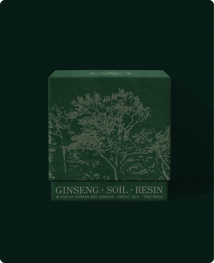
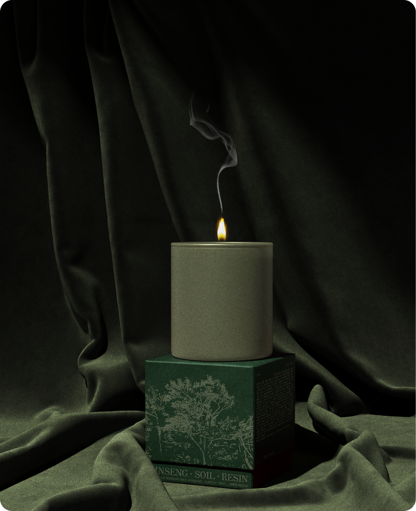
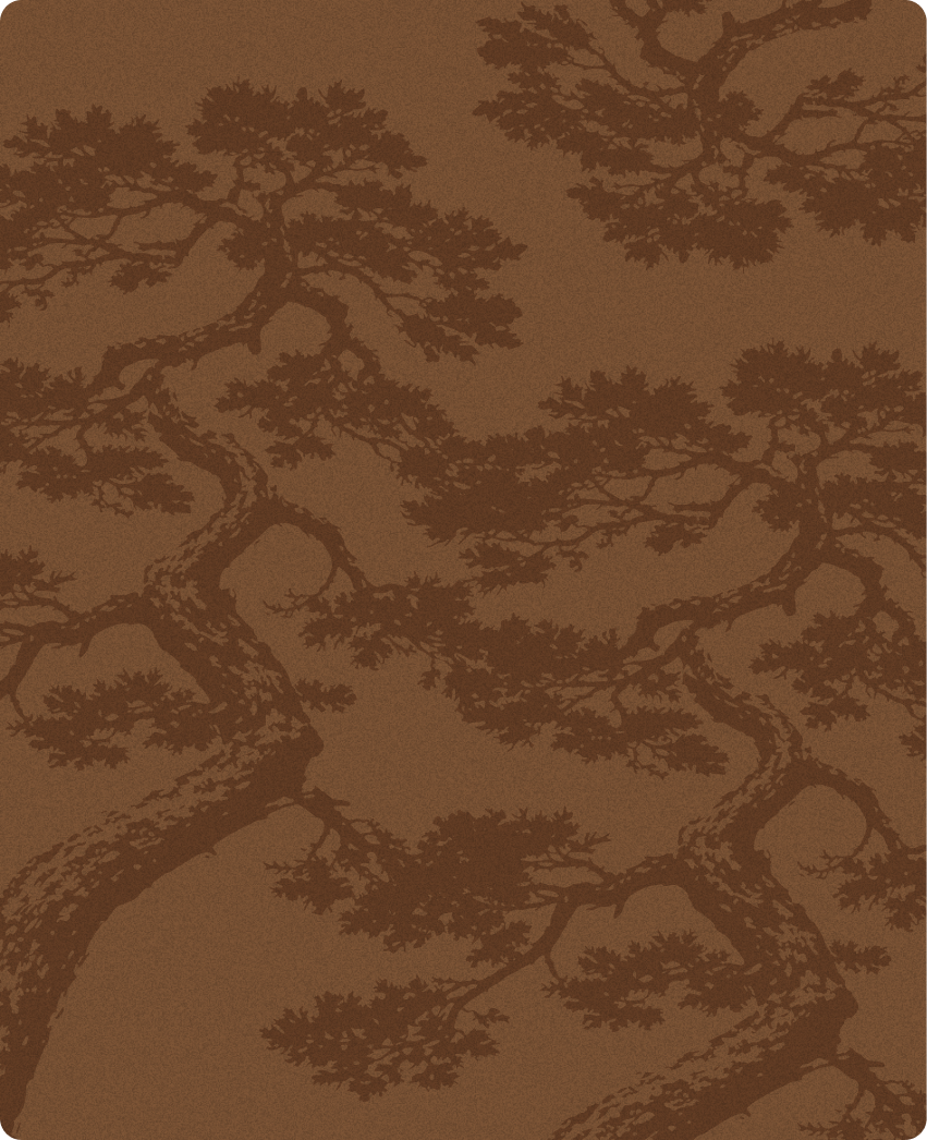
Built from a single cultural reference, centered around Green Forest Soju: pine, a symbol of resilience and permanence in Korean culture.
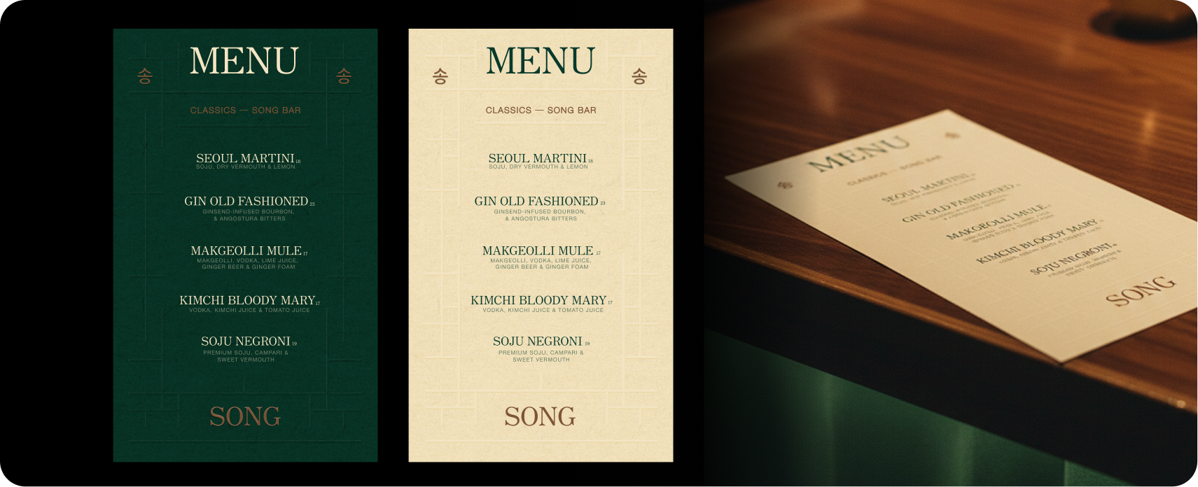
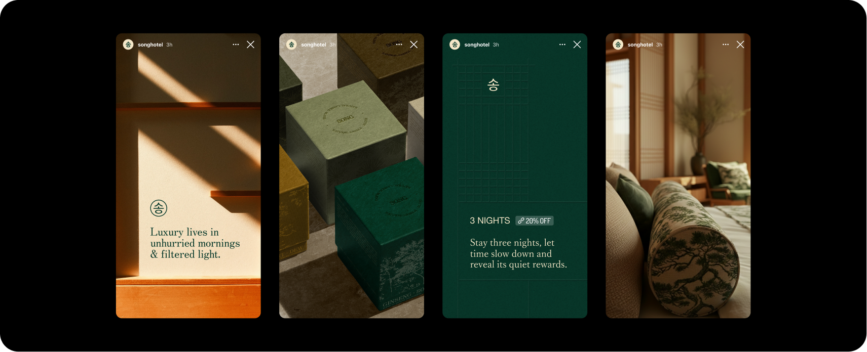
The system extends into every touchpoint: bottle label, candle, soap packaging, menus, signage, textiles, and a complete website.
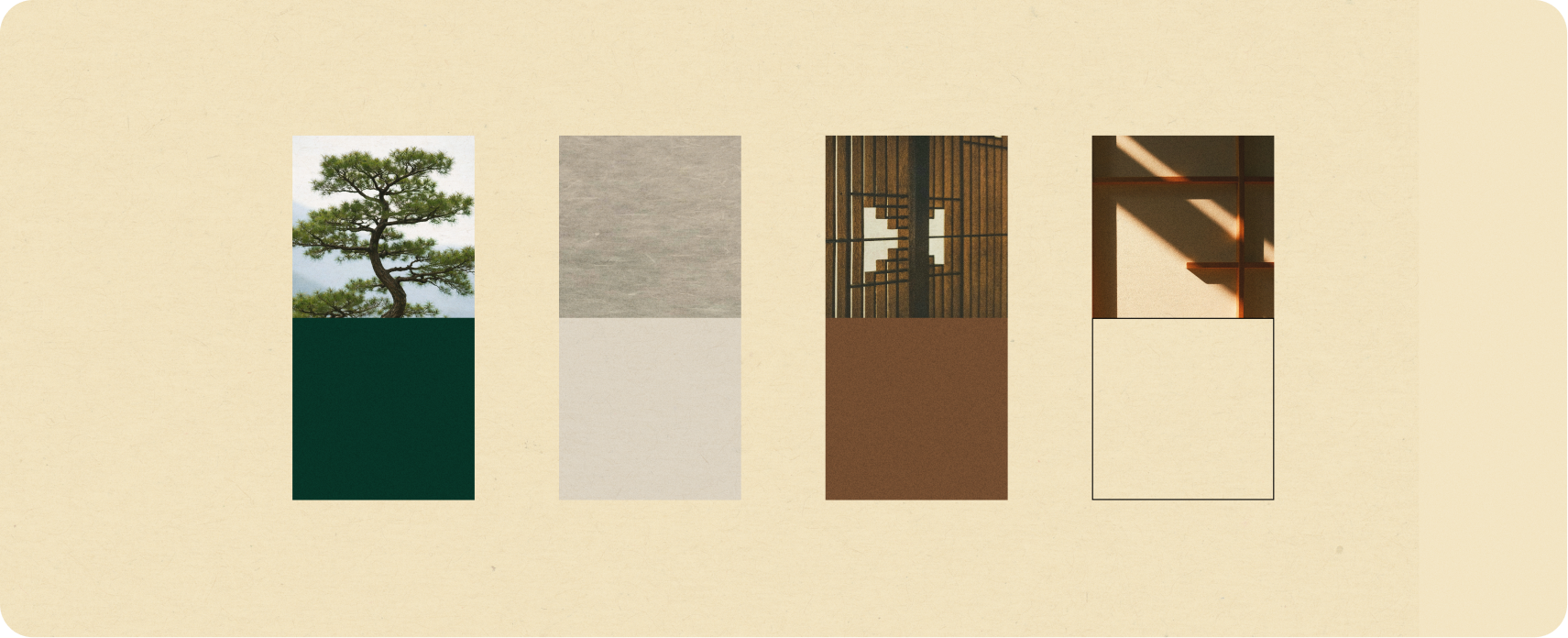
The visual identity draws from hanji paper textures, hanok architectural grids, and a restrained natural palette. Every detail rooted in the same idea: calm, intentional, cohesive.